Colour Card
Championing Colour
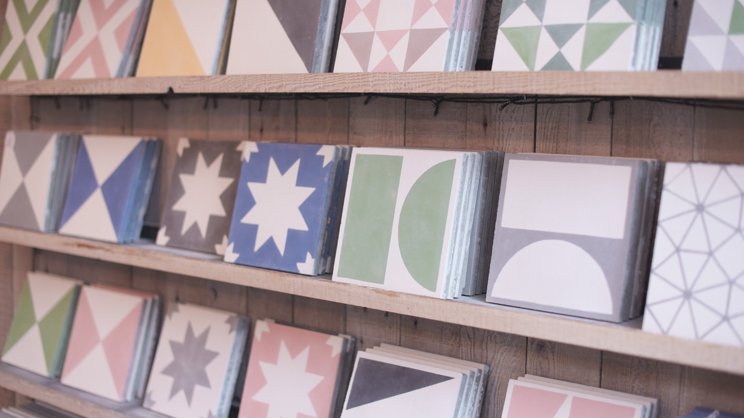
Committed to exceptional materials and fine craftsmanship, the Bert & May name is synonymous with a raw yet refined aesthetic. Their tiles are created with longevity in mind and colour at their core. Bert & May has an extensive range of tiles including cement, glazed, reclaimed, terracotta, marble and terrazzo. Colour is the key differentiator in the market and Bert & May wanted to leverage this by creating colour reference guides. Championing the colours amongst interior designers and architects to inspire and provide an easily accessible colour reference guide.
The primary challenge was to digitally capture the unique colour of each tile to faithfully match as close as possible the unique tone of the tiles. Physical samples of each tile colour were meticulously analysed and reproduced in a suitable digital image format for downstream printing processes. As well as the colour, the artisan process of producing the hand-poured cement tiles imparts a varied and distinctive texture to the surface of the tiles. It was crucial to capture this, which was achieved by utilising high-resolution digital scanning of each tile surface.
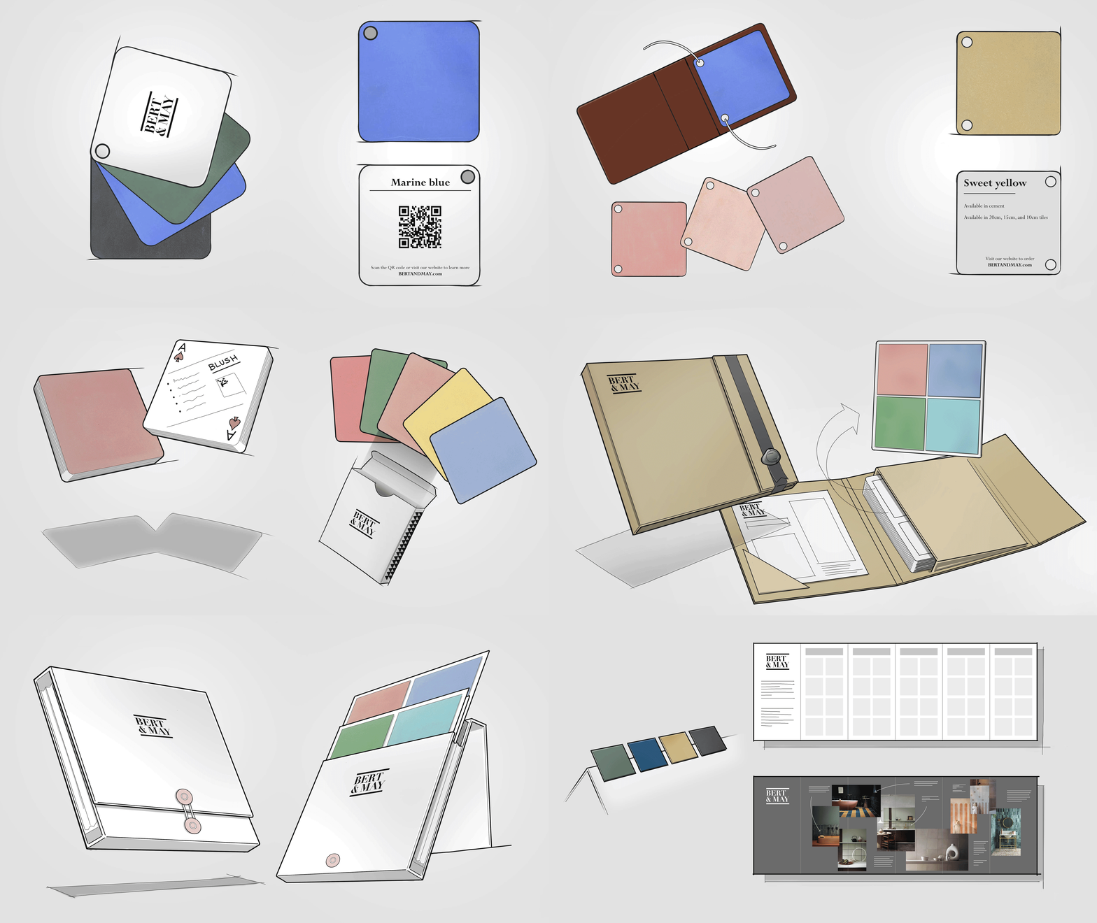
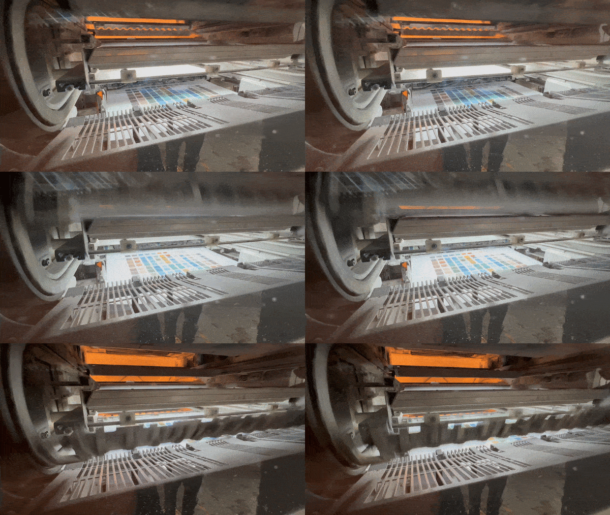
Multiple concepts were explored to uncover the best format for showcasing Bert & May’s core colour collection. The Colour Card emerged as the most practical solution to allow designers and architects easy access to the full range of colours in a compact format. The fold-out concertina-style guide is familiar, akin to paint colour charts, making it possible to view the full-colour range on a single page. The lithographic process was utilised to produce the Colour Card in combination with a uniquely pioneered process applied to each colour to give it a raised profile. The innovative and successful Colour card has been distributed across Bert & May’s trade network in the UK, driving sales and enhancing the communication of their unique product offering.
Creative Direction
Colour Matching
Print Design
Production
Production


